What does dna data look like?
Great question! We combined a bunch of data from a variety of different projects for you to look at and compare. Here you'll find out what bacteria live in lakes, hot springs, snow, and even cockroaches!
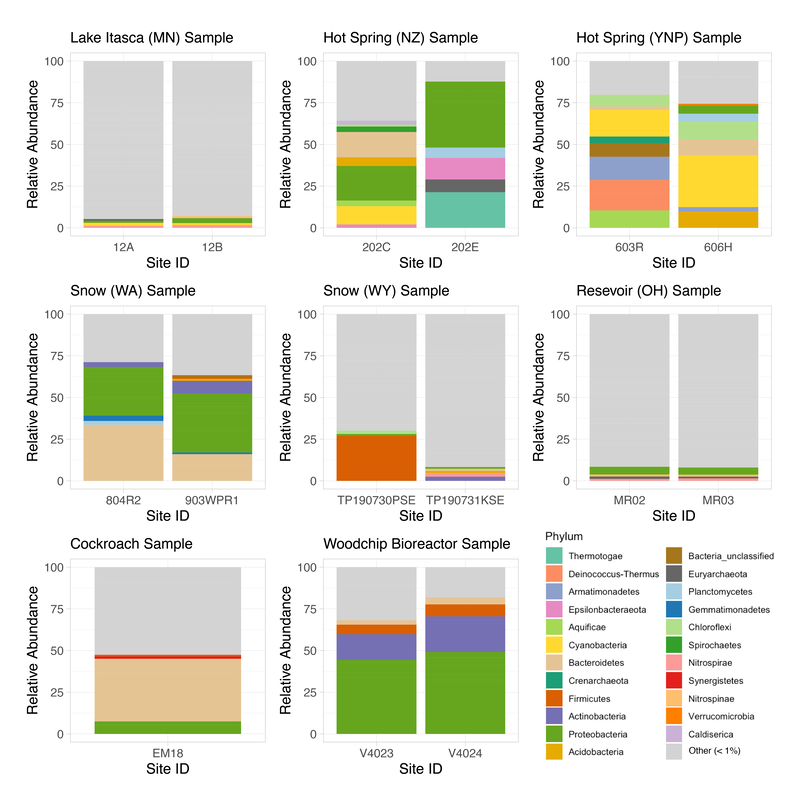
How to interpret this figure:
Relative Abundance, or the percent composition, is plotted on the Y axis, and different samples are plotted on the X axis. If a colored bar is larger, that means the organisms of that Phylum make up a greater proportion of the community.
For example, the green bar in sample 202E of the New Zealand Hotsprings (top middle) makes up ~30% of the total species in the sample. If we look at the legend (lower right) we see that the green bar are Proteobacteria. This means Proteobacteria make up 30% of the New Zealand (NZ) Hot Spring Sample 202E.
What patterns do you see in the data?